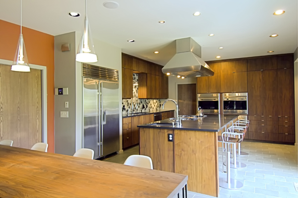
This residential kitchen renovation involved turning an out-of-date, inefficient space into a modern, functioning, family environment. A big buzzword these days is “Mid-Century Modern.” While this term may conjure up images that are uninviting and cold, the raw forms of this sleek, minimalist style lead to a design with sharp lines and a comfortable feel that is anything but cold.

Here is the kitchen before.
The owners of this classic 1960’s style home were seeking a modern design that would create a dynamic heart for this home: a functional workspace for everyday meal prep and living, a pleasant and casual dining area for the family, and an eye-catching center for occasional entertaining.

Another view of the before kitchen
The design challenge was to create a Mid-Century Modern space from this out-of-date, extremely confining kitchen. Keeping in mind the sleek, minimalist characteristics of this style, we needed to create a new kitchen area that was spacious, functional, and inviting.

The space planning for this renovated kitchen required a significant amount of pre-planning. All aspects were taken into consideration: work space layout, plumbing and appliances, countertops, safety, seating and storage. We created the distance between work centers, “the kitchen work triangle”, with no traffic crossing it and maintaining the sum to the three traveled distances no more than 26’-0. We maintain the countertop space to accommodate all kitchen uses, including landing area, preparation/work area and storage. We designed the countertops with eased corners, which are safer than sharp angled edges. Allowed for GFCI protection on all receptacles servicing countertop surfaces within the kitchen. Maintained every work surface is well illuminated by appropriate task lighting and at least one wall switch controlled light must be provided.

This kitchen was renovated and expanded to be a modern and functional, family gathering space. Mahogany wood on the cabinetry and walls adds warmth, and the custom tile backsplash adds a unique touch that provides a welcomed change of texture against the mahogany. The convenient layout accommodates two cooks, and the open floor plan maximizes daylight and integrates the dining bar and prep. areas. The simple, flat panel, vertical grain cabinet doors, combined with the rich honed black granite countertop, and the depth of color and texture of the honed green slate flooring, add not only to the aesthetics of this kitchen, but to its functionality and performance, as well.


