Don’t be afraid of color at home or at the office. While interior colors may be selected according to taste, the right color can make all the difference from making you feel productive & happy to frustrated & over stimulated. Color plays a key role in defining the atmosphere of any kind of interior space—it can either attract or discourage individuals.
Color can be a puzzling decision and if you’re not sure about which shade to select, hire a professional interior designer to assist. However, if you’re the “do it yourselfer” buy a small amount of the paint you like and paint a section of your wall where you can view it in the day, and in the night.
Here is a quick reference:
Blue, green and violet tend to be cool and restful colors. When used on the interior walls they seem to make the room bigger.
Red, orange and yellow tend to be warm and active colors. When used on the interior walls they seem to make the room smaller.
Below is a guide to the way COLOR make us feel:
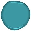
Benjamin Moore CSP-700
Blue: Blue shows up in bedrooms and nurseries (not just for a boy anymore) and as a pale color in living rooms and pharmacies. Blue slows breathing and heartbeat, making you physically feel calmer. After a very stressful day, this could be a nice color to come home to.
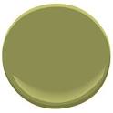
Benjamin Moore 2145-20
Green: When you’re looking for a neutral color but still want color, green is a leading choice, especially in foyers, family rooms, and garden rooms. Green is the easiest color for the eye to see. It’s the best color to use in a bookstore, study, library or child’s room. This color helps you to read, relax and focus. Green is connected with feelings of security and balance.
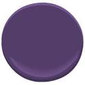
Benjamin Moore 2017-20
Violet: Violet is relaxing, making it a good choice for use in a bedroom. Shades of violet can relieve strain and stimulate us at the same time. Violet also stimulates creativity, making it a splendid selection for an adverting agency.
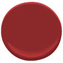
Benjamin Moore AF-290
Red: It’s a stimulating color, so red is a great and obvious choice in a dining room. This is not a good choice, however for a hospital interior. It’s a bold backdrop that strong accessories—like rich porcelain and great silver pieces work well with. Red is the most dynamic and energizing color of the spectrum. The concentration of red can be exhausting: tone it down with shades of green and blue-green.
Benjamin Moore 2015-30
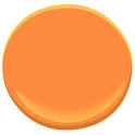
Orange: Orange is an excellent color in the kitchen or dining room for the entertainers. It promotes feelings of excitement. It makes one feel energetic, improves appetite & enhances social interaction.
Benjamin Moore HC-4
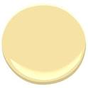
Yellow: We see it most often in kitchens, bathrooms, bedrooms, and dining rooms. Yellow is often considered a happy and sunny color, but it can arouse distress. Spending long periods of time surrounded by bright yellow can make a person irritable and aggressive. Studies shows babies cry more in bright yellow rooms. Balancing yellow with other colors can help lessen this response.
Benjamin Moore 887
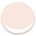
Pink: In varying degrees of strength, it may show up in living rooms, master bedrooms (symbolizes love, joy and romance) and a little girl’s room. As an accessory, in pillows, ceramics, rugs, and art, a little pink goes a long way toward softening hard edges.
Benjamin Moore PM-20
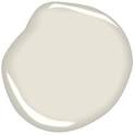
White: It makes other colors stand out, so it’s a great accent color. White also shows up in modernist spaces and serene bedrooms. In a kitchen or bakery, white is the best color. It shows off the colors of food, as if it were a blank canvas upon which the cook creates a meal.
Benjamin Moore 2108-30
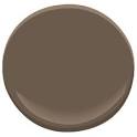
Brown: We found this color in bedrooms, powder rooms, small living rooms, libraries, or offices. It creates a cocoon feeling. This color can be used to produce a stable, established perception.
Benjamin Moore 2132-10
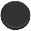
Benjamin Moore 2130-40
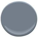
Black & Gray: Are splendid colors for accents on doors and trim. They are stark, and restful. Black gives us a feeling of depth, both in mood and perspective.